Turning listening to yourself into a daily gesture.
A self-tracking wellness app I designed and built from scratch. Five minutes a day to notice the signals of body and mind, without scores and without judgment.
- Year
- 2026
- Role
- Product designer & builder
- Platform
- Mobile first web app, installable on the phone
- Status
- MVP complete, built for daily use
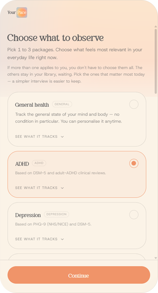
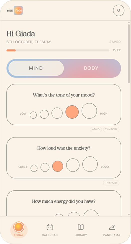
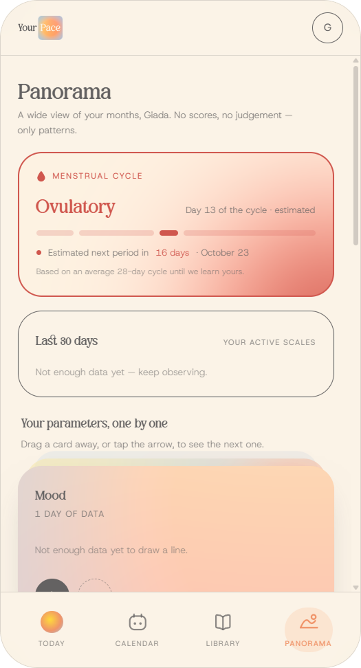
Choose what to observe, answer the daily interview, read your patterns in the Panorama.
Most tracking apps fall into the same traps: gamification, guilt, pressure to score points, too many parameters. The result is that people stop using them, or worse, they end up feeling they have fallen short. I wanted to design a tool where tracking feels like listening, not scoring.
Principles first, then screens.
Before designing any screen, I wrote down the principles the app had to respect. Every design decision that followed came from one of them.
The high fidelity prototype. Tap to try it.
- 1
No judgment
The interview never asks you to grade yourself. Scales answer in words or shapes, never in numbers, because a number invites you to grade yourself while a word invites you to describe yourself. The hardest part was that the Panorama charts need numbers to work. At first, only free text seemed the right answer, until I realised it would make the charts impossible. The solution: people see only words or buttons, while the system quietly saves each position as a number they never see. Free text stays only where the answer is truly open. For the same reason, weight and body measurements are excluded from every package.
- 2
Less is more
Onboarding asks you to choose up to three packages, based on what is relevant in your life right now, and then lets you review your starting set of parameters before you begin. You track only what matters to you, and you can change it at any time. The packages are built on recognised sources such as NHS and NICE guidelines, and presented as support for observation, never as medical advice. You can see the full onboarding below.
- 3
Observation
The goal is to notice patterns, not to judge a single day. Mind and body are tracked separately but read together. A day is kept as it was: past days can't be filled in later, because memory blurs what really happened. The Panorama brings everything together in charts and trends. It runs on simple calculations, without AI: lower costs, and no sensitive data sent to an AI model. Estimates, like the next menstrual cycle, are always shown as estimates.
- 4
No performance
No streaks, no points, no badges. The tone of voice is part of the experience: buttons, hints and messages are written to be gentle and free of pressure, starting from the very first screen.
- 5
Progress over perfection
Healing is not linear, and the app doesn't pretend it is. Missing a day has no consequence, and the library lets you activate only what fits the moment of life you're in.
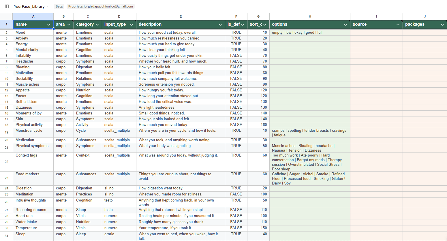
The library behind principle 1: every answer shown as a word is stored as a number for the charts.
Onboarding
The first minutes in the app follow the same principles. A quiet opening screen, a short sign up written to feel gentle, then you choose up to three packages and review your starting set before you begin. Nothing is fixed: everything can be changed later.
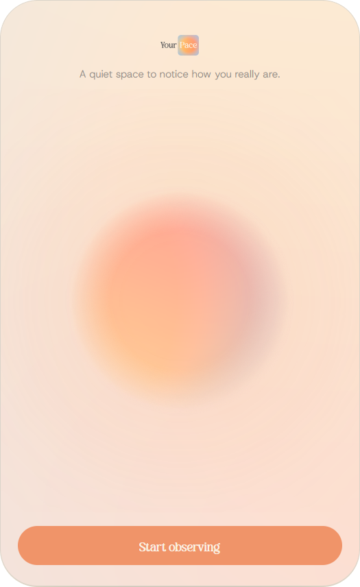
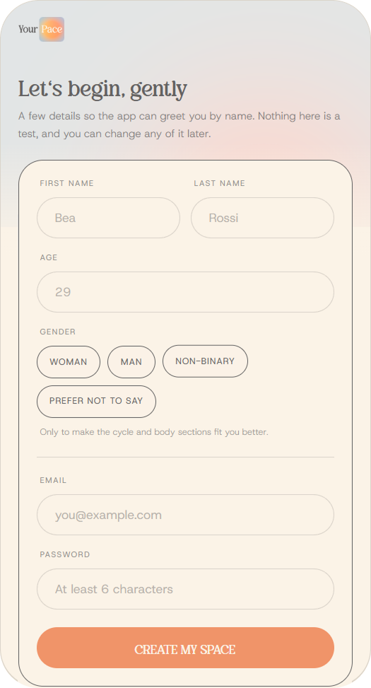
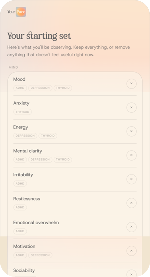
Opening screen, sign up, choose what to observe, your starting set.
From a page of values to a working app.
I designed and built Your Pace on my own, without writing code by hand. Each step used the tool that fitted it best.
Toolbox
Notion
Concept, audience and values
Claude
Architecture, research and prompts
Claude Design
Wireframes and high fidelity prototype
Figma
Brand identity and components
Claude Code
Initial structure and debugging
v0
Developed the screens and components
GitHub
Hosted the repository
Vercel
Deployed every change automatically
Supabase
Saves the data and handles login
- 1
Concept and values
Everything started in Notion: what the app is, who it is for, the values it has to respect and a first list of features.
- 2
Architecture
With Claude, I mapped the sitemap and the user journey, and drew a clear line between what belonged in the first version and what could wait for the second.
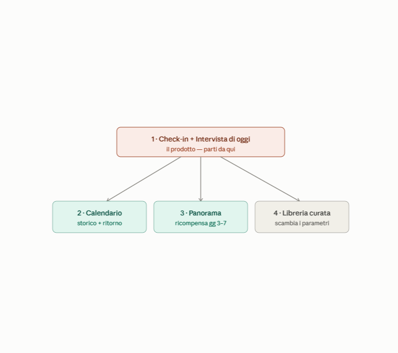
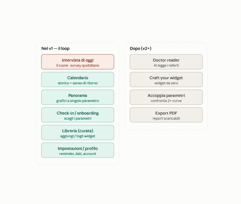
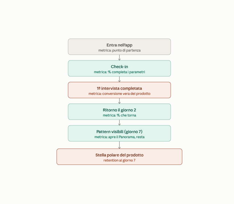
Sitemap, features for v1 and v2, and the user journey.
- 3
From sketches to wireframes
I sketched the home screen and its widgets by hand, then turned the sketches into wireframes in Claude Design.
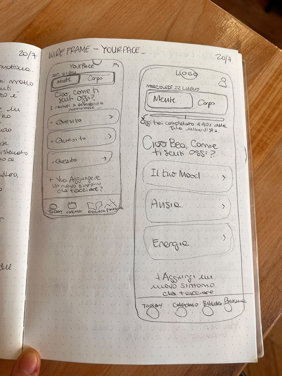
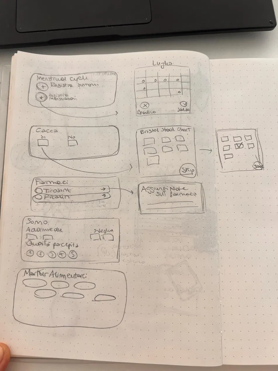
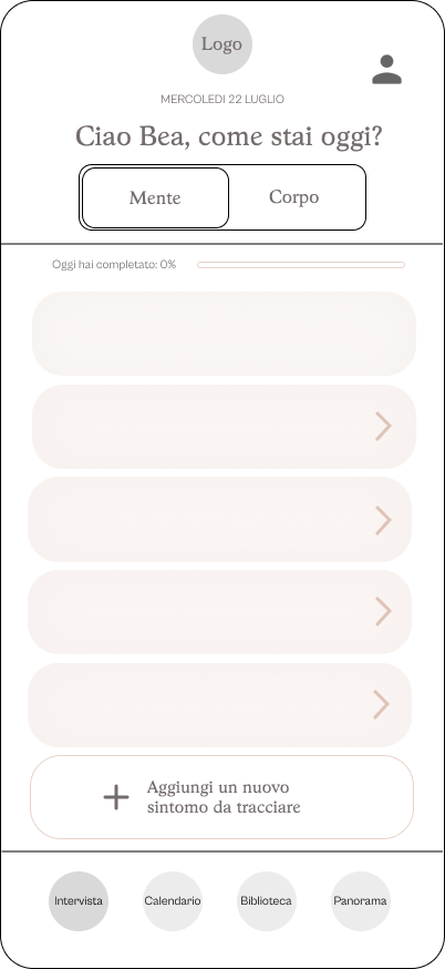
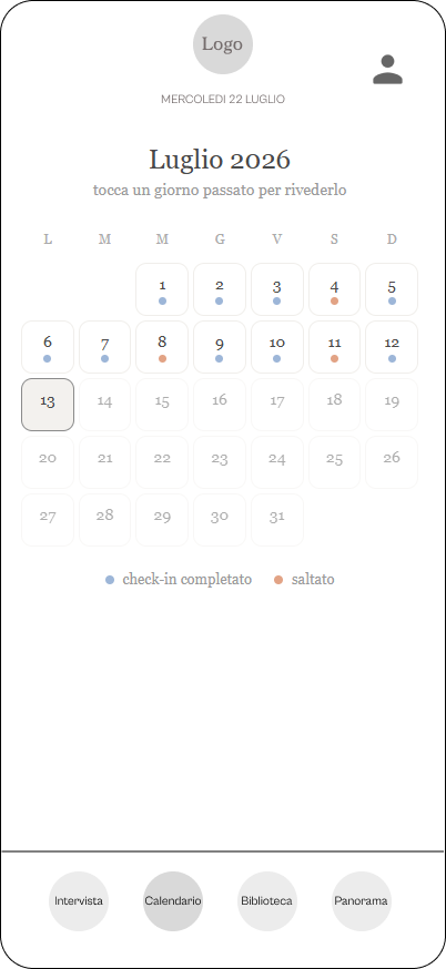
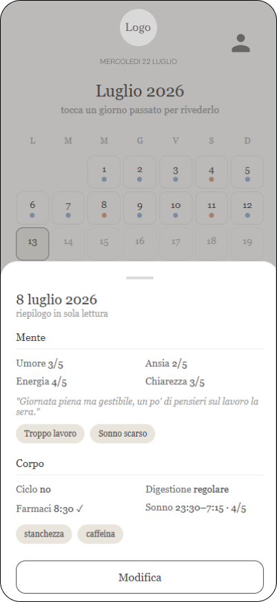
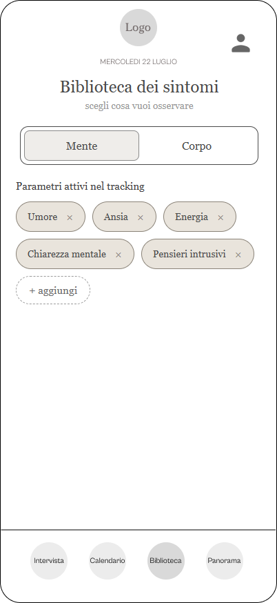
Hand sketches of the home and its widgets, then the wireframes.
- 4
Brand identity
In Figma I defined the brand across three boards: the feeling it should give, the visual style, and the craft details such as palette, fonts, logo and the rules for the gradients.
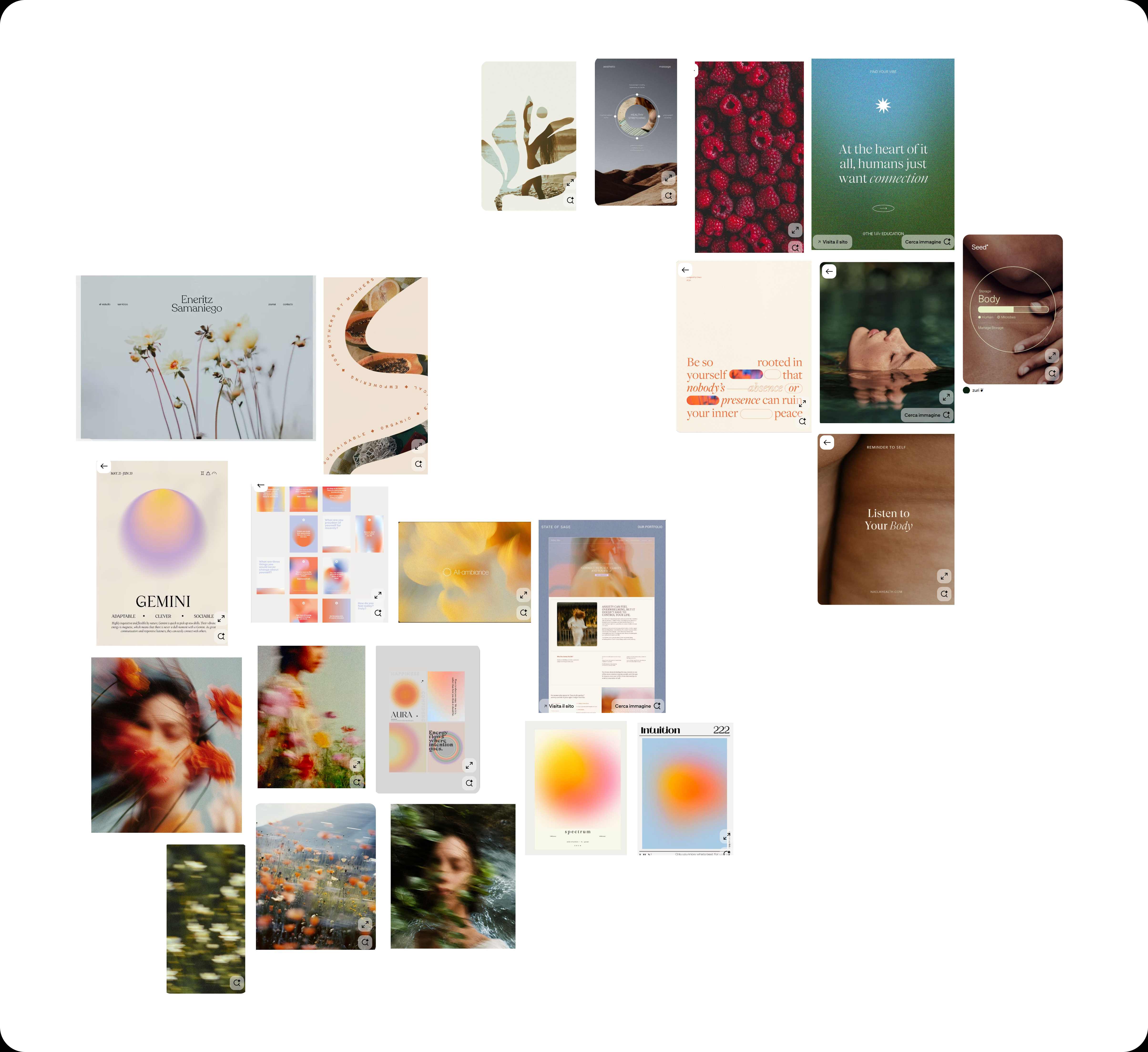
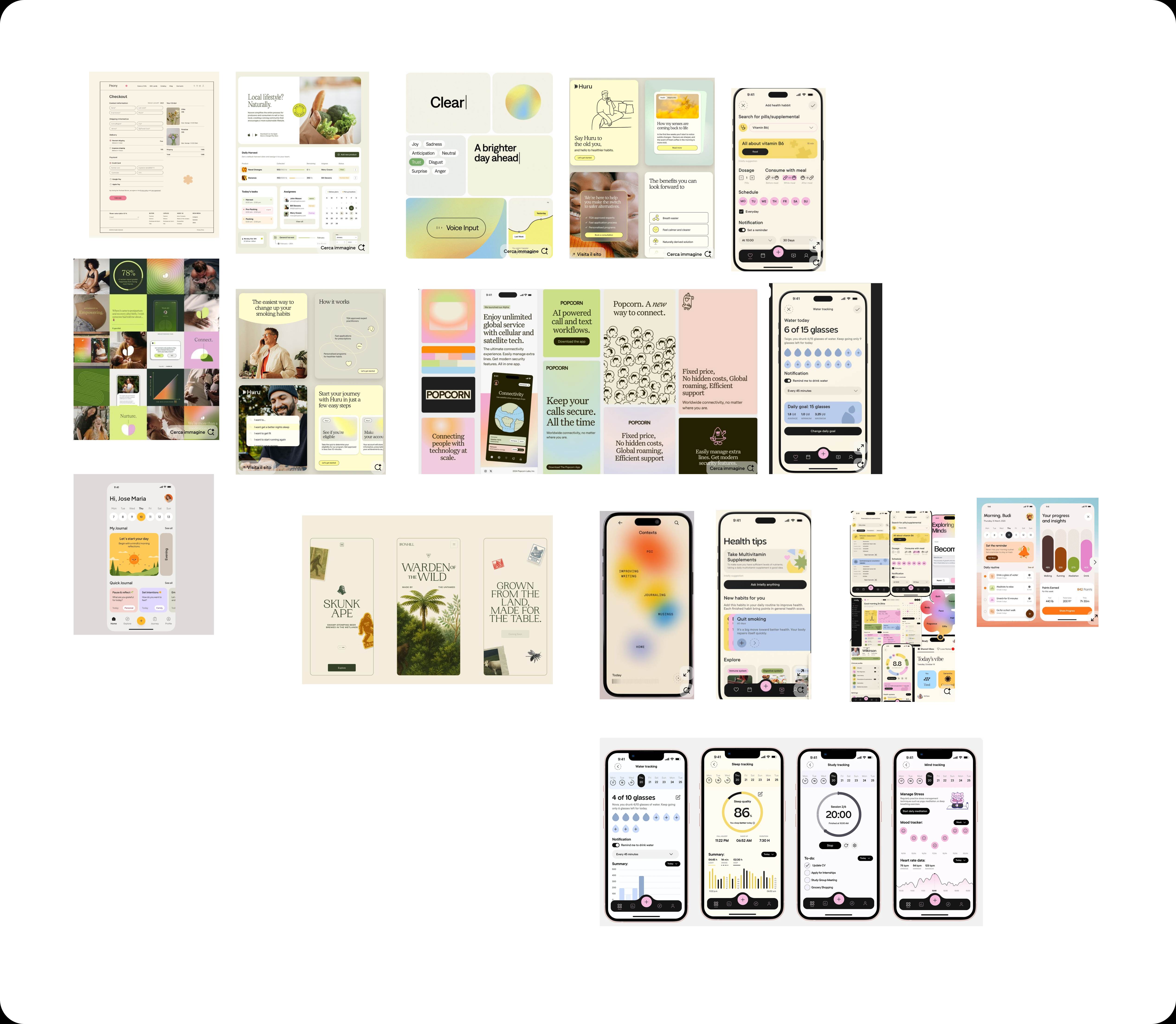
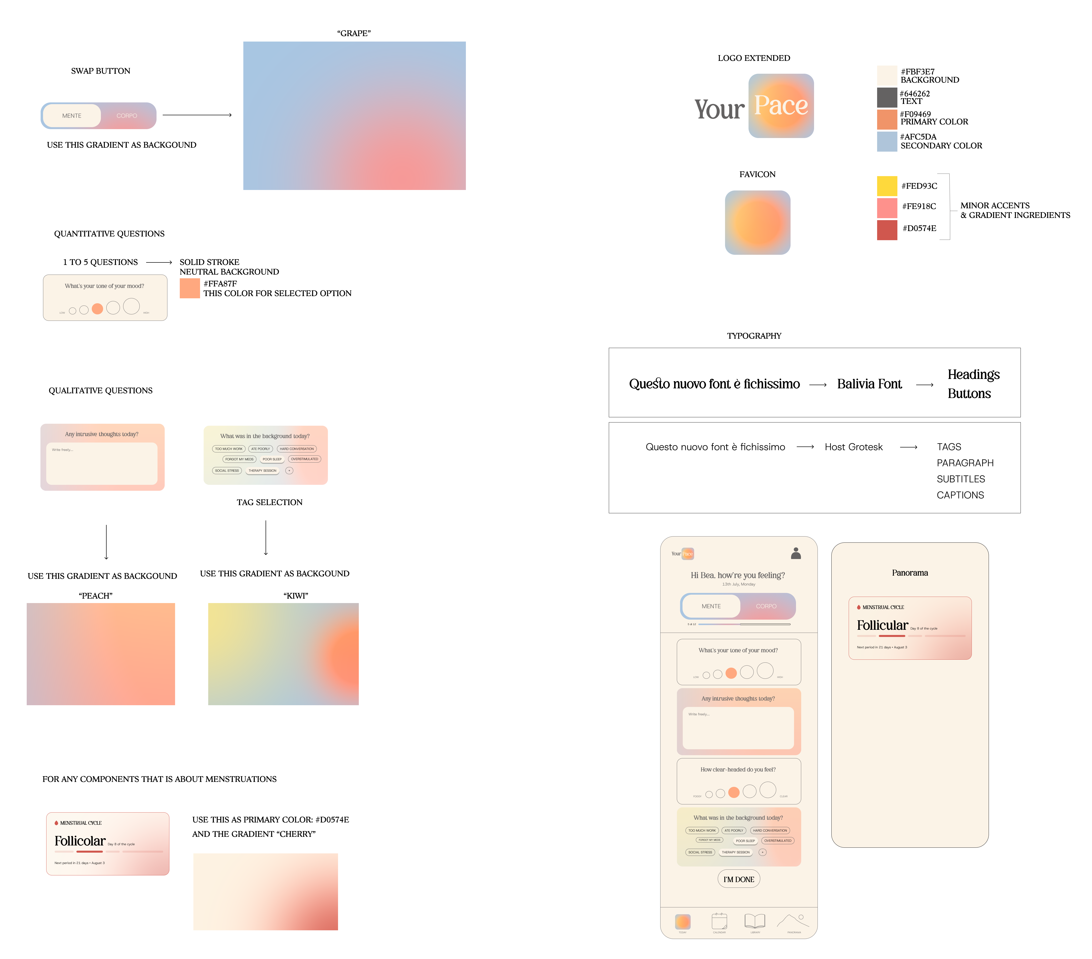
Feeling, style and craft boards.
- 5
High fidelity prototype
I briefed Claude Design with the brand boards and every value written out by hand: colours, fonts and gradient rules. The result was a high fidelity prototype you can try in the Approach section above.
- 6
Building the app
I set up the initial structure of the app with Claude Code, then wrote prompts with Claude and developed the screens with v0, choosing one tool or the other depending on the complexity of each change. Every change goes from GitHub to Vercel and is online automatically. Supabase saves the answers and handles login. The library behind the app, 55 parameters and 13 condition packages, lives in a spreadsheet I built from recognised clinical sources. The app installs from the browser straight onto the phone, with no app store in between.
Where it stands.
The MVP is complete and launching soon to a first group of users. It already includes login, the daily interview, the calendar, the Panorama with charts on real data, cycle tracking, a library of 55 parameters with widgets that adapt to each type of answer, onboarding with condition packages, and installation on the phone.
Left out on purpose
Some features were designed but kept out of the first version. The most important is a reader that would use AI to read medical reports and suggest parameters: I postponed it because it handles very sensitive data. The same goes for PDF export, AI comments on the Panorama and custom widgets. They belong to a second version, once the basics have been tested by real people.
What I learned
Your Pace was my first project built entirely through vibe coding, and I learned a huge amount on the technical side. Claude Code is ideal for setting up the initial structure of an app. Because Claude Code and v0 work on the same repository, deployed on Vercel, I can choose which tool handles each change depending on its complexity. They are also useful for debugging each other's work, or for developing more elaborate versions of the same components. I noticed that each one reviews the other's code with a more critical eye, precisely because it didn't write it.